 |
| Arithmetic Color Progression (left) vs. Geometric Color Progression (right) To perceive arithmetic progression we need to create a geometric progression. |
I now realize I subverted his intention with the overlay exercise by turning it into a study in angles. My overlays changed the color and the angles. The purpose of the overlay was to help us see how geometric actual progression resulted in arithmetic perceived progression. I also realized that I have this intuitive sensitivity to color contrast which made my color contrast exercise very subtle indeed. Fortunately, Mr. Federico understood this and didn't make me do it over again so the contrast would be obvious.
The best part about the class were the crafty-like things we made: a 3-D sculpture form we alternately destroyed and enhanced with color shapes, the booklet with overlays, deconstructed/reconstructed letterforms.
At the back of the book are color theories. Mr. Albers felt that students should explore color prior to being exposed to the theory. Having tried to make sense of color through the exercises, students have a better appreciation of the theories.
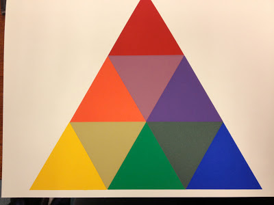
I like Goethe's Color Triangle and wish more people were aware of it and it's brilliant layout. In a small space it accomplishes a lot. I might play around with it in tints and shades. Could be fun, particularly now that it's so easy to make transparency overlays in Illustrator. I can do the geometric vs. arithmetic comparisons until I go blind. And I might also discover more about why I like certain colors and combinations.
 |
| Goethe's Color Triangle |
 |
| Explanation of how the color triangle works. |
No comments:
Post a Comment