My mind sparks in the oddest ways sometimes. The best times are when I've had some really good sleep, like last night. I even woke around 1 a.m. for a brief glimpse of the moon eclipse. And I still got good sleep. (Good Sleeping: topic for another post.)
I started with Camp NaNoWriMo because I'm supposed to be editing my 2009 novel draft. This is a task a lot more difficult than I supposed. I found a great page of links to the stages and parts of revision. After reading one of the posts on types of editing, I decided to follow Amanda On Writing.
I liked the design of her tumblr blog and decided to install the same theme on my tumblr. First, I had to log in. Which was complicated by having to use Chrome since the latest Flash update crippled Safari on my ancient iMac. Soooooo ... reset password adventure!
After updating the tumblr, I had to add a "Pin It" button to my website because resetting the tumblr password meant accessing email. Reading email is always a nexus of distraction. Curse you email links!
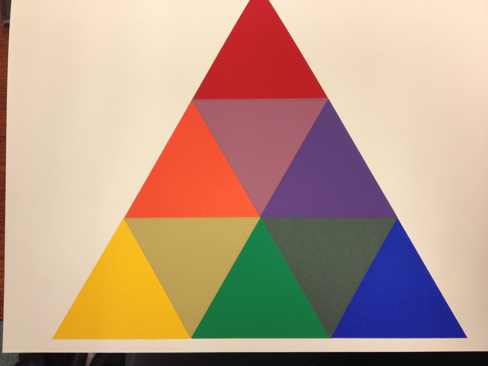
Which led to fiddling with the design of the website because suddenly the colors look all garish after changing to a muted tumblr design. Fiddling with the design means arranging colors, selecting web colors, and trying out textured backgrounds (none of which looked right).
Which brings me here. Time for a break. Then some novel revision. And then, perhaps, more color contemplation.
Showing posts with label discovery. Show all posts
Tuesday, April 15, 2014
Thursday, February 27, 2014
oh hey - i'm on pinterest
Visit Elaine Greywalker's profile on Pinterest. Come see my random visuals.
Monday, November 25, 2013
NaNoWriMo Summation Scene
I am a bit early on this as I have not yet achieved my ultimate goal of 70,000 words. However, I have reached the National Novel Writing Month mandate of 50,000 words. I'm at 50,491 actually.
The joy is there but not the irrational whoops of joy from previous years. I know so much more about novel writing, my creative process, the editing process, and what happens when I finish a book. It is true with novels as with art that you never finish a work. You just stop at an interesting place. It is also true about novel writing that the first draft is just a beginning. For sheer quantities of revisions, script writing for feature films wins out. Novel revisions make up for that in word quantity.
Yes, it's all about revisions folks. Once the glow of creation wears off, it's back to the salt mines of checking plot lines, character arcs, grammar, and other mundane technicalities such as deciding where the chapters begin and end. Unlike my fine art process in which I generally create an image in one sitting with little preparation or afterthought. I suspect my art could use a little kick in the development pants, too.
This year's novel pulled in characters from previous novels, as well as embellished plot lines, and added a third book to the Cosmic Control series. Sorta weird as I had no intention to do any of that when I started writing. I'm still grappling with a summation or log line for the plot. Here's a first try.
Cosmic Control: Defeat of the UnRegs
The story involves two soul twins who were separated before birth and came to life in separate universes with parallel time lines, which should have guaranteed they would never meet. And in a normal world they wouldn't have. However, the Prime Locus is tampering with the time lines again and the twins are needed to thwart his vicious and devious plans to destroy the power of gifteds. Enter the UnRegs—the UnRegistered Citizens—a huge confabulation of pirate-style, off-grid individuals who have been around for so long they are quite numerous and have fostered a wide variety of subcultures. Some UnRegs are lawful, some aren't, and some suffer from situational ethics. They have their own goals for changing history. Within all this, the two sisters must determine a course of action that will save time, prevent collapsing the time lines in favor of the evil Prime Locus, and yet still emerge with their identities and lives intact. (Your basic save the universe scenario.)
It's a lot of fun. Well, it has been for me anyway. And I intend to continue having fun for a couple more weeks yet while ignoring the distant call to get down to serious editing work.
The joy is there but not the irrational whoops of joy from previous years. I know so much more about novel writing, my creative process, the editing process, and what happens when I finish a book. It is true with novels as with art that you never finish a work. You just stop at an interesting place. It is also true about novel writing that the first draft is just a beginning. For sheer quantities of revisions, script writing for feature films wins out. Novel revisions make up for that in word quantity.
Yes, it's all about revisions folks. Once the glow of creation wears off, it's back to the salt mines of checking plot lines, character arcs, grammar, and other mundane technicalities such as deciding where the chapters begin and end. Unlike my fine art process in which I generally create an image in one sitting with little preparation or afterthought. I suspect my art could use a little kick in the development pants, too.
This year's novel pulled in characters from previous novels, as well as embellished plot lines, and added a third book to the Cosmic Control series. Sorta weird as I had no intention to do any of that when I started writing. I'm still grappling with a summation or log line for the plot. Here's a first try.
Cosmic Control: Defeat of the UnRegs
![]() |
Working cover with working title. |
It's a lot of fun. Well, it has been for me anyway. And I intend to continue having fun for a couple more weeks yet while ignoring the distant call to get down to serious editing work.
Wednesday, October 30, 2013
Sunday, August 11, 2013
another one
Still playing with ArtRage. Although, I've nearly convinced myself that I need Photoshop, at the very least. This comes from watching brave, professional artists give away their processes, tips, and tricks for free on CreativeLive. I love it!
![]() |
another one |
Wednesday, July 24, 2013
iDraw vs Art Rage
![]() |
Showing all the brushes and some stickers and a bit of glitter. Too much fun! |
I suppose iDraw is better for vector and opens Adobe Illustrator (IL) files (another legacy file, of which I have many).
I don't really want both. I may not have a choice. Still, together they are a lot cheaper than subscribing to PS and IL.
Brushes are what I need to be expressive. Vector is very good for detailed, fussy work. Brushes are more spontaneous. Yet another plus: Art Rage works well with my Wacom tablet and pen.
Thursday, July 11, 2013
cleaning creatively or forward into the past
For at least a year I've been using knitting and crocheting to clean out my (possibly) 10-year stash of yarns and unfinished projects. I had, for example, the remnant of a very expensive heavenly purple cotton yarn I once bought on impulse. I didn't buy a lot of it (see: expensive) and couldn't make anything truly useful. I knit a summer vest and added expensive sculpted silver buttons. They were all ocean themed: fishes, sand dollars, shells. Not practical although they did work as fasteners.
The vest didn't fit. I persisted in wearing it for a couple of summers. I don't know where it is now. Probably in my son's attic waiting for me to shrink into it.
I managed to use up the last few bits of the purple yarn today as trim for an iPhone cozy. Because sometimes I don't have any pockets for the phone and I put it in my purse where it rumbles around getting scratched. The screen has two light scratches (that you can't really see unless you hold it at an angle to the light). Anyway, I've been wrapping it up in a silk handkerchief which is okay unless I need to use the handkerchief. Which happens.
To make the cozy, I used up what remained of some Aunt Lydia's No. 3 Fashion thread (which I actually bought for a planned project—as opposed to the dreamy "some day" projects) and the lovely expensive purple yarn.
Results:
1.) I had fun.
2.) Knitting (the body) and crocheting (the edging) kept me from chewing up my cuticles or eating unsuitable food.
3.) Using up the remnants reminded me to be serious about my projects. Because if I don't follow through they haunt me.
4.) I had the satisfaction of finally putting to use some yarn that's been tucked out of sight but not out of mind. Ergo: a little weight off my mind.
5.) I designed and created something unique and expressive. Sure, it's a bit wonky, but the joy of creating—particularly on the fly—outweighs any wonkiness.
The joy of wonkiness is why I continue to use up and finish the old projects. At least the yarn-based ones. I'm nearly done and I've been steadily rewarding myself with a new project each time an old one is completed. A new real project, thoughtfully chosen and carefully executed. And then there's one more result:
6.) I've learned to take projects seriously because time and resources go into them and some of them hang around for a long time, so might as well do it right.
What I'm really doing is exercising my creative muscles in an extreme way by confining myself to what's available. That and making way for new, better projects and more opportunities for wonkiness. All that in a little iPhone bag.
The vest didn't fit. I persisted in wearing it for a couple of summers. I don't know where it is now. Probably in my son's attic waiting for me to shrink into it.
![]() |
Did you know that nothing is exactly the size of an iPhone? I stuffed this with two matchboxes and a Post It Notes pad to get the size right. Because the only camera I have is in my phone. |
To make the cozy, I used up what remained of some Aunt Lydia's No. 3 Fashion thread (which I actually bought for a planned project—as opposed to the dreamy "some day" projects) and the lovely expensive purple yarn.
Results:
1.) I had fun.
2.) Knitting (the body) and crocheting (the edging) kept me from chewing up my cuticles or eating unsuitable food.
3.) Using up the remnants reminded me to be serious about my projects. Because if I don't follow through they haunt me.
4.) I had the satisfaction of finally putting to use some yarn that's been tucked out of sight but not out of mind. Ergo: a little weight off my mind.
5.) I designed and created something unique and expressive. Sure, it's a bit wonky, but the joy of creating—particularly on the fly—outweighs any wonkiness.
The joy of wonkiness is why I continue to use up and finish the old projects. At least the yarn-based ones. I'm nearly done and I've been steadily rewarding myself with a new project each time an old one is completed. A new real project, thoughtfully chosen and carefully executed. And then there's one more result:
6.) I've learned to take projects seriously because time and resources go into them and some of them hang around for a long time, so might as well do it right.
What I'm really doing is exercising my creative muscles in an extreme way by confining myself to what's available. That and making way for new, better projects and more opportunities for wonkiness. All that in a little iPhone bag.
Monday, June 3, 2013
I found your beard
Location:
East Ocean View Norfolk
Thursday, May 16, 2013
Who I write like today ...
Because it's a different author every time I try this. Perhaps I am an emerging novelist.
Wednesday, March 20, 2013
Making a Textured Sketch from a Digital Photo
Technically, the photo is a virtual one. I made the scene out of primitives and meshes and then "photographed" the rendered image. Still looking for ways to make satisfying landscape art without Bryce. Here's a mixed media sketch one of my landscapes, Bowl of Water.
I thought it might be fun to make this appear to be a sketch from life on a another planet. I like the effect, achieved with commercial filters and brushes, with some personal modifications. Heres' the original image.
The effect is not as sketchy as I imagined it would be, particularly from a distance. Close up you can see more texture. Sometimes I wish for a way to blow up the image to about five times the size to make the texture stronger.
![]() |
Bowl of Water (sketched) by Elaine Greywalker |
![]() |
Bowl of Water by Elaine Greywalker |
I did enjoy the brushes. Nice to get back to a bit of gestural involvement.
Tuesday, March 12, 2013
Blue Brushy Desktop Wallpaper
Sorry, but I have to post this wallpaper I made from an old Harry Potter desktop. I extended it to fit my huge 24" screen. I also made a brush that is fairly amazing. It has a stroke that varies organically, makes splatters, and strange ink flows. Then it alters again if you change the size of the tip. Cool. At the moment the brush is saved with a bunch of others. If I ever isolate it, I'll give it away. You'll be the first to know.
![]() |
My patronus and Chinese astrological sign. I love these colors! |
Thursday, February 28, 2013
4 Painterly Photoshop Experiments
Devoted the day to painterly explorations following a Jack Davis webinar on Creative Live (as part of their Photoshop Week). He is so talented and so good at translating physical art into digital art techniques. I'm a real sucker for texture.
Here are some of my photos turned into painterly works using the free download of textures, actions, patterns, and brushes that Jack gave us. You can get them from his Facebook page, if you "Like" him.
His pattern overlays are quite lovely. The impasto strokes come in three sizes (small, medium, and large). The canvas texture is highly realistic. Some of the features only work in Photoshop 6.
He's going to be on "all day" tomorrow. Sign up is free for the live event. Recorded classes cost and come with some extras.
Here are some of my photos turned into painterly works using the free download of textures, actions, patterns, and brushes that Jack gave us. You can get them from his Facebook page, if you "Like" him.
![]() |
Modified with Jack's Sketch action in Photoshop. The action removes color. I put some back. |
Combination of Jack's actions. A true experiment.
I had no idea how this would turn out.
Attempting oil colors using some of Jack's
stuff and some of my own.
![]() |
Blue Clematis using the Photoshop Fresco filter and Jack's pattern overlays. |
![]() |
Detail of Blue Clematis to show more texture. |
He's going to be on "all day" tomorrow. Sign up is free for the live event. Recorded classes cost and come with some extras.
Tuesday, February 26, 2013
color study: Jasper Johns
I'm not studying Jasper Johns' color palette. I'm using this particular image of one of his works to contemplate my color preferences. Could be the sun penetrating to grass or (as the title suggests) lightly falling snow.
All of the base colors are the same brightness and lightness (tints of four colors, basically). They suggest luminousness and joy and dancing and summer warmth. Yet, why I like this piece probably has more to do with pink than the other colors, although I like tropical aqua, too.
Friday, February 15, 2013
Not Winter
I intended to make a winter abstract and this came out instead. I miss summer. Those lazy, childhood summers on the beach with a slight breeze, cool waves, and endless sunny days. Or it could be those summers between my high school years that were so lazy and laid back. Hanging out with friends, swimming, lazing in the grass, dreaming of the future—that kind of thing. Bicycles! Yep. I miss all that.
Thursday, February 7, 2013
Keeping track and staying motivated
Or maybe it's staying on track and keeping motivated. Either way, I've made a little spreadsheet to list all of the projects I assign myself in my daily round. Not included are all the books I make myself get from the library. I have a goodreads account for that, although not all of the books make the list.
So, here's the crazy stupid header for my little spreadsheet. I can make it only so much fun before it becomes a chore. It serves the purpose and merely opening this puppy each day is enough to get me going. As long as I open it.
Tuesday, February 5, 2013
scribble text effects for breakfast
Fooled around and fell in love. Although, I'm sure it's just puppy love.
After fooling around with the scribble effect, layer transparencies, and gradients, I discovered the Scribble presets. Not all the descriptors are good. Childlike doesn't seem to be really child like. Tight is good, though. You can see my modification of it below. I varied the spacing a bit.
It was a good breakfast.
![]() |
Fooled around with the Scribble effect, adding in the Appearance panel, combining a gradient with texture, and modes in Transparency. |
![]() |
Today's initial experiment with Scribble and adding fill and line in the Appearance panel. |

![]() |
Steady on, captain! Nearly monochromatic palette might indicate I've found a happy medium. Nice to have a lined paper texture on file. |
Monday, January 21, 2013
Color: a Study Without Conclusions
Arithmetic Color Progression (left) vs. Geometric Color Progression (right) To perceive arithmetic progression we need to create a geometric progression. |
I now realize I subverted his intention with the overlay exercise by turning it into a study in angles. My overlays changed the color and the angles. The purpose of the overlay was to help us see how geometric actual progression resulted in arithmetic perceived progression. I also realized that I have this intuitive sensitivity to color contrast which made my color contrast exercise very subtle indeed. Fortunately, Mr. Federico understood this and didn't make me do it over again so the contrast would be obvious.
The best part about the class were the crafty-like things we made: a 3-D sculpture form we alternately destroyed and enhanced with color shapes, the booklet with overlays, deconstructed/reconstructed letterforms.
At the back of the book are color theories. Mr. Albers felt that students should explore color prior to being exposed to the theory. Having tried to make sense of color through the exercises, students have a better appreciation of the theories.
I like Goethe's Color Triangle and wish more people were aware of it and it's brilliant layout. In a small space it accomplishes a lot. I might play around with it in tints and shades. Could be fun, particularly now that it's so easy to make transparency overlays in Illustrator. I can do the geometric vs. arithmetic comparisons until I go blind. And I might also discover more about why I like certain colors and combinations.
Goethe's Color Triangle |
Explanation of how the color triangle works. |
Friday, December 21, 2012
Color: A Study of Ourselves
I thought I was going to get a book from the library. Instead, I got this entire box full of color folio pages and a book. I could only look at it in the library because it's the original 1963 Yale edition of Josef Albers' The Interaction of Color. A librarian had to get it from Special Collections and bring it out to me.
The librarian asked me to wash my hands if I were using a hand lotion (I wasn't). She also told me that gloves were no longer required as they made it difficult to handle the pages.
Here's the lovely room they provide for non-circulating fragile books.
Here's the box with folio pages of color to match the exercises in the book.
Here's a diagram page from the book.
... and some sample color folio pages. They were silk screened apparently.
Albers felt paper was better for color study because it avoided mixing paint (laborious and not always accurate) and allowed easy reuse of the colors.
I began this journey when I looked over some scribbles I did in Adobe Ideas on my phone and noticed that they were all explorations of palettes. I still wonder why certain colors attract me. Albers writes, "... everyone has preference for certain colors and prejudices against others. This applies to color combinations as well." And also, "As we begin principally with the material, color itself, and its action and interaction as registered in our minds, we practice first and mainly a study of ourselves." The important part: as registered in our minds. Because color is a subjective experience.
So, no short cut for me. No web page that says, "Right here, Elaine, is the answer to why you prefer certain colors and color combinations."
I only got about half way through the book today. Looking forward to going back and finishing. I remember some of the lessons and ideas from art school in the 70's. Still true today, although many of us take them for granted i.e., stare at a color and then look at a white page and see its opposite, surrounding colors affect how we perceive a color, etc.
I continue in awe of the master, Josef Albers.
The librarian asked me to wash my hands if I were using a hand lotion (I wasn't). She also told me that gloves were no longer required as they made it difficult to handle the pages.
Here's the lovely room they provide for non-circulating fragile books.
Topeka Room in the Topeka and Shawnee County Public Library |
Here's the box with folio pages of color to match the exercises in the book.
Here's a diagram page from the book.
... and some sample color folio pages. They were silk screened apparently.
Showing how transparency causes "plastic action" or artificial depth. |
Free form color exploration example. |
Albers felt paper was better for color study because it avoided mixing paint (laborious and not always accurate) and allowed easy reuse of the colors.
I began this journey when I looked over some scribbles I did in Adobe Ideas on my phone and noticed that they were all explorations of palettes. I still wonder why certain colors attract me. Albers writes, "... everyone has preference for certain colors and prejudices against others. This applies to color combinations as well." And also, "As we begin principally with the material, color itself, and its action and interaction as registered in our minds, we practice first and mainly a study of ourselves." The important part: as registered in our minds. Because color is a subjective experience.
So, no short cut for me. No web page that says, "Right here, Elaine, is the answer to why you prefer certain colors and color combinations."
I only got about half way through the book today. Looking forward to going back and finishing. I remember some of the lessons and ideas from art school in the 70's. Still true today, although many of us take them for granted i.e., stare at a color and then look at a white page and see its opposite, surrounding colors affect how we perceive a color, etc.
I continue in awe of the master, Josef Albers.
Tuesday, December 18, 2012
Why those colors?
![]() |
The Palette. |
I'm interested in discovering why certain colors and combinations appeal to me at various times. The beach theme I get. The rest, not so much.
I wish I would post one of these a day and sort of discuss it a bit. Probably won't.
Here's the full image from the previous post and the four colors involved.
![]() |
purple, green, lavender |
Monday, December 10, 2012
Subscribe to:
Posts (Atom)